1. BACKGROUND AND THE GOAL.
Old Member Benefits Landing Page Experience
|
The Goal.
AARP is located in Washington D.C., so unfortunately I wouldn't get a lot of face-to-face time with them when I worked with them at my agency. However, the UX in Marketing representatives, whom I interacted with on a weekly basis, decided to come visit and talk big ideas. At the time, there was one landing page "template" we used to advertise what AARP has to offer for both prospective and current members to get them to join or renew, respectively. However, the current template didn't cover the breadth of an AARP membership and the worst part was, it wasn't relatable. These were the key criteria the new landing page was to have. Thus, the goal was simple, design a new landing page that covers mostly everything AARP has to offer, and make it relatable to its users. |
|
Diving Deeper.
During the "Big Ideas" meeting, the client, account managers, and myself discussed how to create a landing page that both covered everything AARP had to offer, and was relatable to its users. The key demographic here are people aged 50 - 65, and of course a big question at that age is "how can I make the most of my remaining years?" Well, current members of AARP are going through the same thing, why not have members themselves explain the true value of AARP, and how it has helped them live their best life? Previous research conducted both by myself and AARP as an organization revealed 4 key areas of a membership members find important: Discounts, Health Resources, Retirement Tools, and the fact that AARP is an advocate. This was the breadth of AARP. I reiterated to the group the importance of relatability, and research with non-members has shown the desire for real member testimonials. AARP also has 38 million members, so you, as the non-member, have to fit in somewhere. |

|

|
Personas.
We found out a way to combine breadth and relatability: Personas. We could have a real AARP member on this new landing page that essentially "represents" a particular area of membership, and have that member help communicate to non-members how helpful it has been for their life. It's informational, it's conversational, and it's relatable. User testing I had done in the past also revealed the desire for actual video testimonials, so this would be something we would want to integrate. But there was this other concept of scope: AARP has 38 million members, so you definitely can fit in somewhere. Early on in the experience, this would have to be communicated. We could essentially filter users by their interests early on, and provide them with the information most relatable to them quickly. |
2. DESIGN.
Initially, this project was assigned to Robert, a graphic & visual design contractor; however, I did my best to paint a picture of how to integrate user feedback, best practices, and all of the information discussed in the "Big Ideas" meeting. Robert and I worked very well together, and it didn't take long for us to come up with some ideas.
The "Persona Navigation."
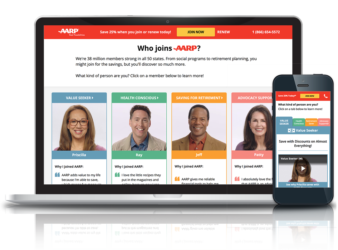
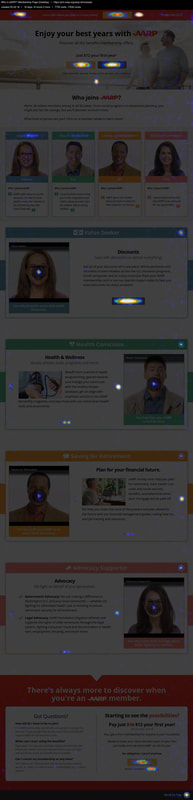
This was our design solution to the following challenge: filtering users early on so they can attain relatable information quickly. Users could click on a "person" (i.e. an AARP member) that represented the user's key interests. These personas were created based on the four breadth categories mentioned above:
The "Persona Navigation."
This was our design solution to the following challenge: filtering users early on so they can attain relatable information quickly. Users could click on a "person" (i.e. an AARP member) that represented the user's key interests. These personas were created based on the four breadth categories mentioned above:
- The Conscious Spender (later changed to "Value Seeker") - if the user is in it for the discounts, they'd identify most with this persona
- The Wellness-Focused Individual (later changed to "Health Conscious") - if the user wants a membership to help stay healthy, they'd identify most with this persona
- The Caregiver & Investor (later changed to "Retirement Saver)" - if the user wants financial tools to assist with retirement saving, they'd identify most with this persona
- The Advocate (later changed to "Advocacy Supporter") - if the user wants to be a part of an organization that advocates for seniors, they'd identify most with this persona
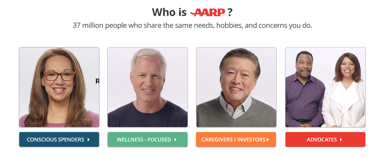
The original persona navigation devised by Robert and I. Users would click on the persona they identify with the most (who happens to be an actual AARP member), and be taken to a module on the page providing relevant information.
Persona Modules & Videos.
The persona navigation would allow users to narrow their focus, and link to a module on the page providing more information about what AARP offers in regard to the persona they chose. In addition, users would have the opportunity to watch a short video of the member telling them how AARP has helped them, and how it could help the user as well. Inclusion of these videos was based user feedback gathered over the course of 6 months of data collection. Many users would remark at how useful a testimonial video would be to better understand what people in their age group get from AARP. In addition, videos add to the overall relatability of the webpage, as the AARP members in the testimonial videos are likely in the same stage of life as the users.
I opted for carousels within these modules to allow for a sizable amount of information without overloading the user. Users can click he arrows to navigate between slides containing information pertinent to the module they selected. For example, if the user identified most with the "Health Conscious" persona and chose to view that module, he or she could scroll through slides explaining the different ways AARP can keep you healthy. Below is a screenshot of one of these modules:
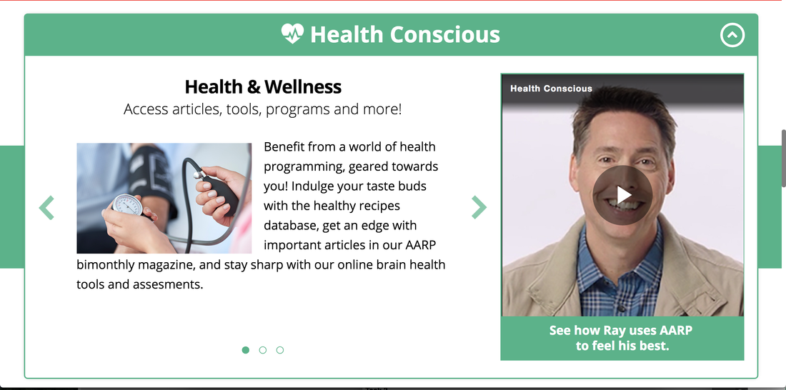
The "Health Conscious" Module
Rating Sliders.
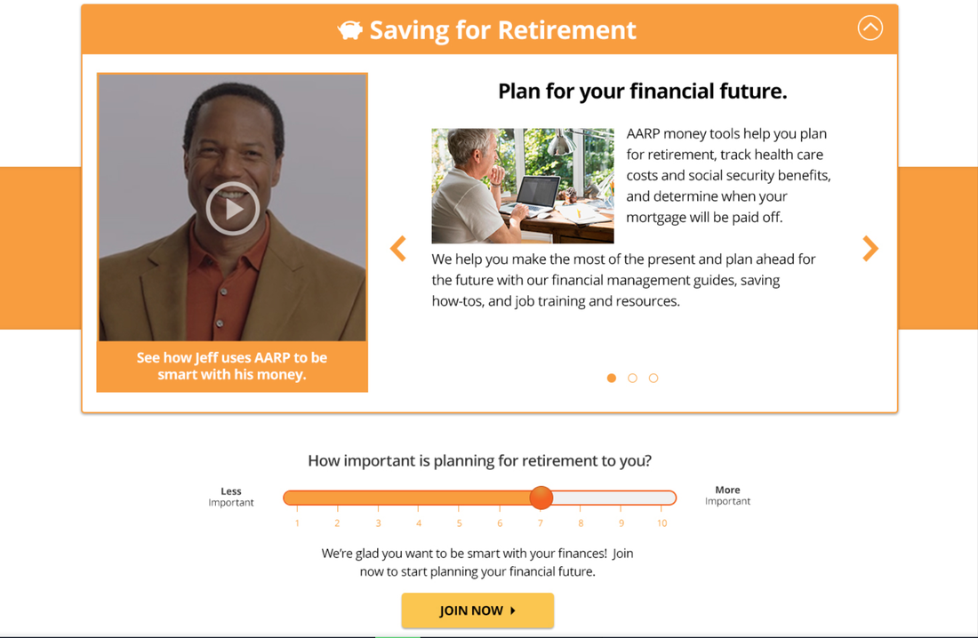
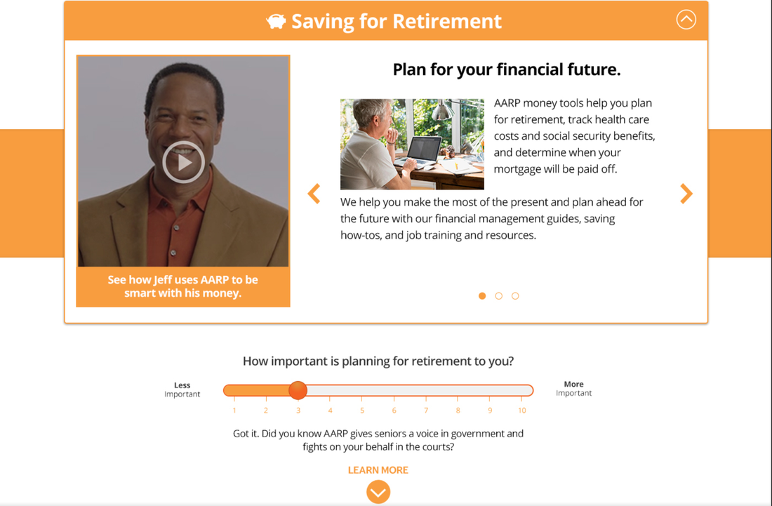
When initially brainstorming ways to make the page more interactive and conversational, we though it might be interesting to ask questions for users to answer on the page. Answering these questions would help narrow down the user's interests to find out how AARP could best be of service. We designed this such that a a question would appear below each module, and it would ask "How important is __________ to you?" The blank refers to the content of the module above the question. For example, the question below the "Health Conscious" module, would ask "How important is being healthy to you?" The user could rate this importance on a scale from 1-10. If a user selected anywhere from 1-6 (i.e. a negative response), that indicates the material isn't important, so a message would appear with a CTA directing the user to the next module. If the user selected anywhere from 7-10 (i.e. a positive response), then we would essentially say "Great! Sounds like AARP is perfect for you!" and include a CTA to join. Below is the "Retirement Saver" module showing the positive and negative responses to the slider questions:
When initially brainstorming ways to make the page more interactive and conversational, we though it might be interesting to ask questions for users to answer on the page. Answering these questions would help narrow down the user's interests to find out how AARP could best be of service. We designed this such that a a question would appear below each module, and it would ask "How important is __________ to you?" The blank refers to the content of the module above the question. For example, the question below the "Health Conscious" module, would ask "How important is being healthy to you?" The user could rate this importance on a scale from 1-10. If a user selected anywhere from 1-6 (i.e. a negative response), that indicates the material isn't important, so a message would appear with a CTA directing the user to the next module. If the user selected anywhere from 7-10 (i.e. a positive response), then we would essentially say "Great! Sounds like AARP is perfect for you!" and include a CTA to join. Below is the "Retirement Saver" module showing the positive and negative responses to the slider questions:
"Positive" Slider Response
|
"Negative" Slider Response
|
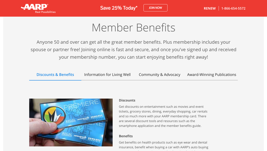
A Usable Way to Present Discounts.
One of the main design challenges faced here was in regard to the "Discounts" persona. The good majority of our members join for the discounts, and it was imperative to have a usable way of obtaining this information. A lot of the ideas being thrown out concerned an accordion style layout like the one below:
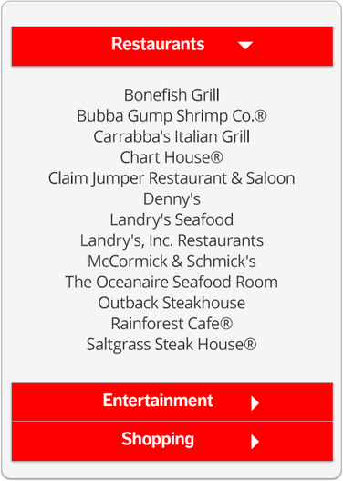
Original proposed design to present discounts. User would click a CTA in the "Conscious Spender" module that would bring up this accordion modal. Organizations where members can receive a discount are organized into categories and users click the arrow to open a drawer.
Modals already open up a can of usability issues (especially on mobile); however, due to two reasons I must keep confidential, a modal was the best treatment. The main issue here was the accordions. The lists of organizations got pretty long, and there ended up being 6 benefits categories. So, we would have to squeeze 6 drawers into one modal, have users open a drawer to show the content, and likely have users scroll within the accordion (which likely couldn't show a lot of items at once due to the lack of space). There had to be a better solution, so I started drawing up some ideas:
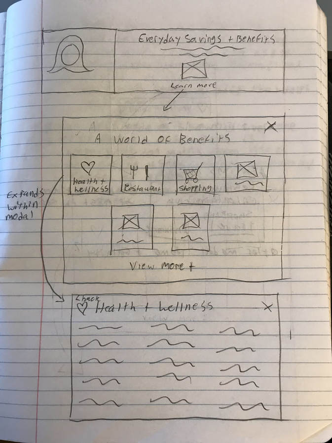
Drawing of my proposed design for discounts presentation.
In this design, users would simply click on a CTA that said "Learn More" or "Explore Discounts" and it would open up a model containing icons for different discount categories to click on. Clicking on an icon would bring the user to a page dedicated to that category within the modal so they can peruse those discounts without spatial interference of the other categories. Navigation back to the categories was simple: just click "Back to Categories" to return back to the category icons, or click the "X" to close the modal altogether. Some discount categories did have long lists, and while it wasn't 100% usable, users would have to scroll within the modal to view occluded items. However, the presence of a scroll bar was included, and a snippet of the next item was included upon landing to get users to scroll:
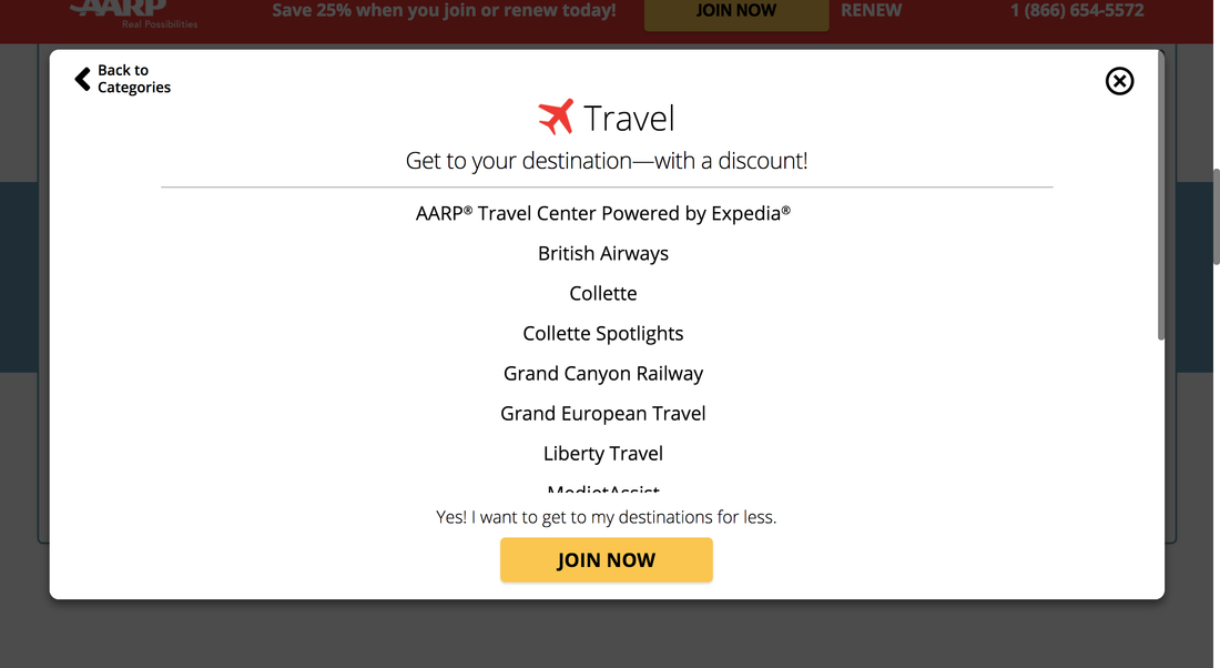
Discounts modal with scroll bar on the right and cut off list item cue to get users to scroll.
While it was different than anything AARP has ever done, the client was excited about it, and along with mostly everything about the landing page, it had to be validated through user testing prior to launch.
3. REMOTE USER TESTING
Prototype.
User testing was conducted on a prototype of the interactive landing page which I created in InVision. You can view a PDF of this prototype below:
User testing was conducted on a prototype of the interactive landing page which I created in InVision. You can view a PDF of this prototype below:
Test Goal & Research Questions.
**Note** This user test was "quick & dirty." I was requested to obtain a set of launch-critical usability issues in a short very short period.
Goal: uncover any launch - critical usability issues such that they can be resolved prior to launch. Thus, the deliverable of this test was a set of usability issues to be remedied before launch of the landing page.
Research Questions:
Task & Question Development.
Tasks and questions were devised for users to complete and answer remotely. As with any usability tests, development of these items was based on the research questions. By the end of the test, I want to make sure I have answers to these key research questions. I started out with some mind mapping and ultimately created a test that addressed the research questions:
**Note** This user test was "quick & dirty." I was requested to obtain a set of launch-critical usability issues in a short very short period.
Goal: uncover any launch - critical usability issues such that they can be resolved prior to launch. Thus, the deliverable of this test was a set of usability issues to be remedied before launch of the landing page.
Research Questions:
- Do users find the interactive elements intuitive?
- Do users find these elements useful in making their decision?
- Do element outcomes map on to user expectations?
- Do users like the interactive elements (i.e. are users satisfied?)
- Do users find this page to be helpful in their journey?
Task & Question Development.
Tasks and questions were devised for users to complete and answer remotely. As with any usability tests, development of these items was based on the research questions. By the end of the test, I want to make sure I have answers to these key research questions. I started out with some mind mapping and ultimately created a test that addressed the research questions:
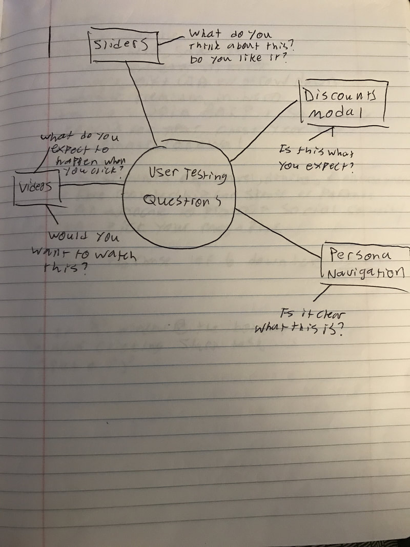
User Test Mind Mapping
Analysis & Results.
My go to method of qualitative analysis is the open coding method. I create categories based on the tasks and questions asked to users, which ultimately represent what I want to learn about as a researcher. For example, in this case, there were A LOT of experimental elements. These included the persona navigation, discounts modal, rating sliders, etc. These formed the "categories" of my qualitative analysis. As I go through the user videos, I take extensive notes and assign each task a "tag" which correspond to the categories I established. This makes it easy to group together quotes and learnings for each user. For example, if one of my categories is "rating sliders" (because that is an experimental element I am interested in gaining learnings for), then when the user gets to a task, or answers questions regarding the rating sliders, I start my notes with the category tag within the user testing software so I can remain organized.
As I go through the data, I lump quotes and other learnings into the categories and read through them. I can now perform a factor analysis by consolidating what users are saying into key issues or learnings. This test was quick and dirty, so the analysis was a bit lack luster, but below is an example of how this looks:
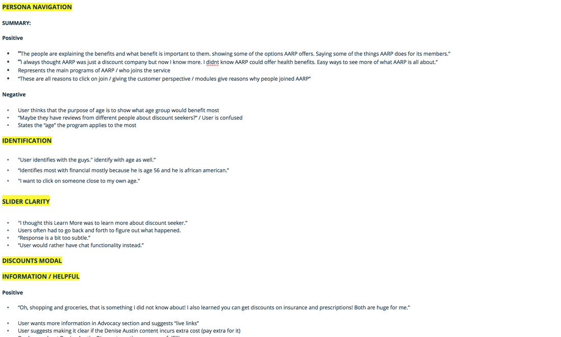
Partial Qualitative Analysis (Quick and Dirty)
There were two launch-critical usability issues that needed to be resolved:
- Users were identifying with personas based on their age and skin color, rather than their AARP breadth area.
- Sliders were distracting users from conversion goals, and their function was not clear.
Both persona ages and the sliders were ultimately removed. As mentioned above, the rating sliders were intended to give the page a more conversational tone, and help users isolate their interests. Based on testing and user feedback, this element was not accomplishing its intended goal, and likely could have made for a more confusing experience for users overall at launch.
4. DESIGNING THE MOBILE EXPERIENCE.
Challenges.
One of my many regrets with this project was not taking a mobile-first approach, as there were a lot of non-transferrable elements in the desktop experience. The persona navigation could not be replicated in a mobile friendly fashion, and I wanted to avoid modals as much as possible (usability best practice). Since we are conveying a lot of information on this page, I took a look at other sites that do the same. Sites like Facebook and Youtube use tabs effectively to section out information and filter it so users only see what they want to see.
The AARP interactive landing page had 4 key breadth areas, and realized that these 4 areas could just be 4 tabs on the interface. It would accomplish the same thing as the persona navigation, as users could still filter their interests early on in a usable fashion.
Wireframing.
The quickest way to wireframe (at least in my opinion) is to draw it out, so that's what I did! Below was my preliminary design for the mobile version of the AARP interactive landing page:
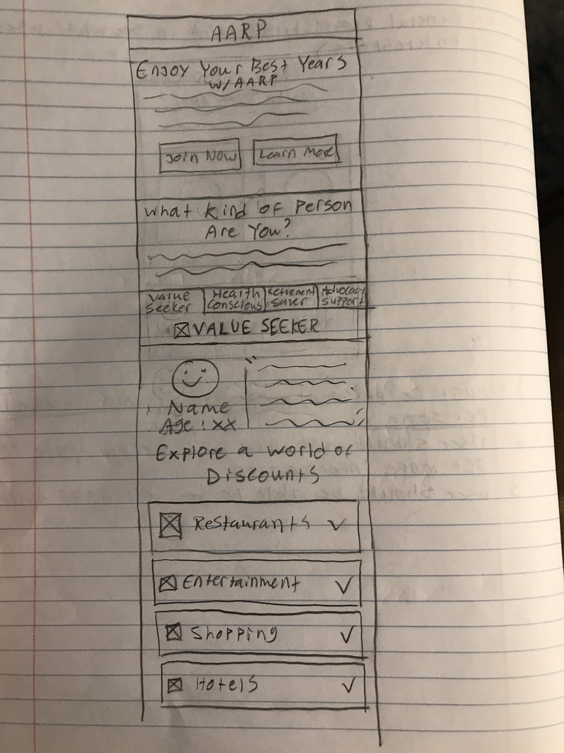
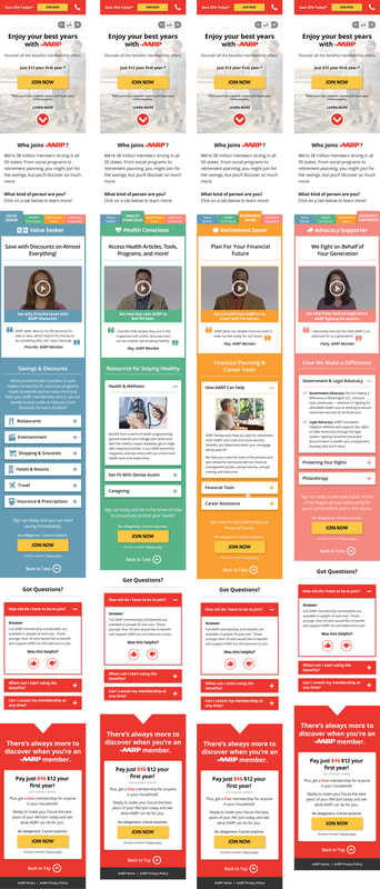
My initial wireframe of the mobile version of the AARP Interactive Landing Page.
As you can see, each persona is a tab in the interface. Each tab includes all of the information that was in the modules in the desktop version. The video is essentially the first thing the user sees, so relatability can be conveyed early on. I got great internal feedback on the design, so I went to Adobe XD to create a more fleshed out mock-up of the design. Below is what I created:

Mock-Up of the Mobile AARP Interactive Landing Page
The client was very excited by the design, so I fleshed out the design in Photoshop.
Final Design & Testing.
The client wanted the mobile version up and running quickly, and while I recommended user testing the design prior to launch, it was decided to launch it and test it post-launch. I am actually in the process of reviewing data now! Either way, below is the final design, and a button to view a PDF of the prototype.
The client wanted the mobile version up and running quickly, and while I recommended user testing the design prior to launch, it was decided to launch it and test it post-launch. I am actually in the process of reviewing data now! Either way, below is the final design, and a button to view a PDF of the prototype.
Final design of the Mobile AARP Interactive Landing Page
5. DESIGN ITERATION & OPTIMIZATION.
I like to triangulate click-tracking (heat map) data, qualitative user testing data, and web analytics to paint a clear picture as to what needs to be optimized for the next iteration of design. Below are heatmaps of the desktop and mobile versions of the page:
Desktop Heatmap
|

Mobile Heatmap
|
These heatmaps tell me where users are and aren't interacting. For example, in the desktop version above, we can see that the persona navigation and videos aren't getting a lot of interaction. This suggests that users either aren't noticing these elements, or are not interested in interacting with them. However, from this data alone, we cannot make any strong inferences. By doing user testing, I was able to find that users were actually scrolling right past the persona navigation on desktop and were not paying much attention to the videos. On mobile, the videos do not seem to be getting any interaction, and through user testing I also found that users were scrolling right past them. IN the user test, I deliberately didn't ask users to perform any tasks or answer questions about the videos, because I wanted to see if they'd notice them. From this, I was able to determine that the lack of interaction is an awareness issue. However, even this is still not enough to truly fix the issue.
The main business KPI of interest is conversion. Thus, we want to optimize the page to improve this metric, and that entails focusing on elements of the page that can help with this goal. The videos may not be getting a lot of clicks; however, are the users that actually are clicking also converting more frequently than those that are not? Do users who watch these videos tend to not convert? Based on the answers to these questions, I can determine whether elements, such as the testimonial videos, are worth optimizing. The true answer may be to replace them with content that could be more useful. The best way to answer these questions is through web analytics. Through event tracking, we can see if a user that clicks a video also converts. This data, combined with the others, can allow me to make impactful decisions for how to best optimize the page.
The main business KPI of interest is conversion. Thus, we want to optimize the page to improve this metric, and that entails focusing on elements of the page that can help with this goal. The videos may not be getting a lot of clicks; however, are the users that actually are clicking also converting more frequently than those that are not? Do users who watch these videos tend to not convert? Based on the answers to these questions, I can determine whether elements, such as the testimonial videos, are worth optimizing. The true answer may be to replace them with content that could be more useful. The best way to answer these questions is through web analytics. Through event tracking, we can see if a user that clicks a video also converts. This data, combined with the others, can allow me to make impactful decisions for how to best optimize the page.