|
|
MeUndies Order Tracking Experience Redesign
Role: Digital Product Designer Experience: tracking.meundies.com Reimagining how MeUndies customers track their orders. |
Background & GoalWhen a MeUndies customer places an order, they are sent an email containing their order number and a link to track the status of their order. This link takes the customer to a page hosted by an external vendor, WISMOLabs, that specializes in development and metrics tracking for order tracking experiences. In addition to allowing customers to track their order, the page also houses marketing assets aimed to drive customers to other areas in the MeUndies ecosystem. The current tracking page had no cohesion and was plagued with user experience issues. It was also visually inconsistent with the brand visual ID my team and marketing have been working to distribute across the site.
The goals of the order tracking redesign project were to:
|
Old order tracking page.
|
Aligning with Customer Experience
Before jumping into design, I connected with our head of customer experience, Ro, to better understand the most pressing issues customers were inquiring about when tracking their order. She audited our ZenDesk chat logs, and identified some key areas where the experience could be improved:
Simplify the Experience: Customers complaints were frequently about the calendar widget on the page. Ranges were way too long, and the calendar itself was not providing any helpful context. The calendar and estimated delivery ranges were also quite small due to the oversized marketing asset to the right of it. There was also a map on the page to show where the delivery destination is in relation to our warehouse. This was not particularly helpful to users--maps are quite helpful when the user themself is traveling somewhere, but seeing their address in relation to a warehouse was not something they were concerned about. This map was also quite large, was not very functional, and made for a messy page layout overall.
Lack of Direction When Something was Wrong with an Order: When a customer had an issue with an order (e.g., never received, or wrong product), there was no information on the tracking page to help them rectify it. This led to increased inquiries to our customer experience team, when they could have easily identified how to resolve the issue from our help center.
Oversized poorly placed assets minimized space for critical information.
|
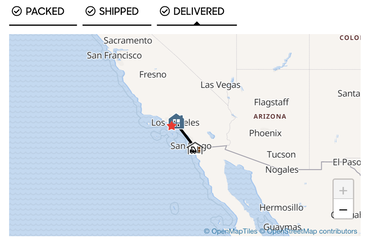
This map provided little value to the user experience.
|
Wireframing
The general approach I took with wireframing was to simplify the experience and prioritize primary user tasks in the visual hierarchy. When going onto the order tracking page, users are primarily looking for their estimated delivery and status of their order. They might also want to view very recent tracking updates to get a more granular look at where their shipment is in the process. In addition, the ZenDesk audit revealed that users wanted a simpler page, and the removal of unnecessary widgets that didn't really help users accomplish their primary tasks.
My first concept (left) emphasized the use of progress indicators to communicate journey information, and called out estimated delivery date in bold lettering in the upper left (where the user will be looking immediately on page load). User tasks were prioritized over marketing assets in the information hierarchy, with order status and tracking updates appearing higher than marketing assets.
My second concept (right) aimed to give marketing assets a bit more prominence, and deprioritized tracking history in the information hierarchy since users are primarily looking for estimated delivery and the general status of their package (e.g., shipped). This design allowed for two marketing assets to be shown above the fold, guaranteeing their visibility on desktop interfaces.
Two concepts I explored for the order tracking page.
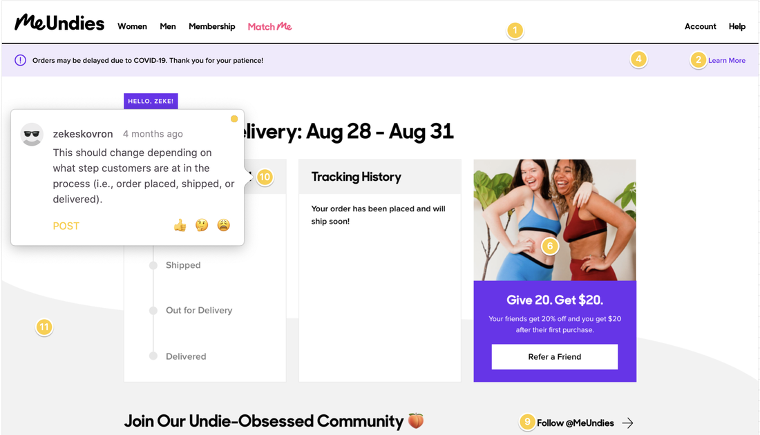
Aligning on a Final ConceptFinding Balance
After pitching these concepts to our design lead and site merchandiser and getting their feedback, I resolved on a combination of the two. I used a similar layout to the second concept, which consisted of three equal sized rectangles horizontally placed on the grid. However, instead of using two of them for marketing assets, I opted to make the second rectangle a scrollable container for tracking updates. On mobile, this became an expandable and collapsible section that showed the three most recent tracking updates (which is what most users would want to see anyways). These rectangles also stacked neatly on mobile, which eased development effort. More secondary marketing assets were placed lower on the page, under the driver to our instagram. Providing Direction I also wanted to address the lack of direction in the delivered state if a user had an issue with their order. After working closely with our head of customer experience, we aligned on adding some brief copy with a link to an article in our help center that described what to do if there was an issue with an order. We were both confident this would help reduce the number of inquiries they receive from customers. |

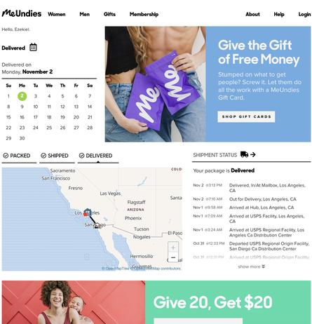
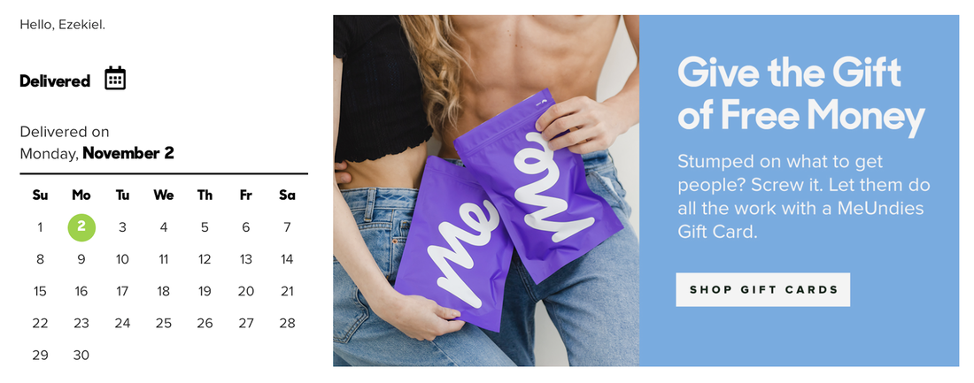
Final design with copy and help link.
|
Annotations for offshore developers in Zeplin.
|
Collaborating with Our VendorAfter internally aligning on a concept, I scheduled some time to walk through designs with our vendor who managed the development team. I created InVision prototypes to demonstrate functionality and annotated them with comments, so we could focus the meeting on clarifying any unknowns. I received very minor feedback, but was told the designs would be quite easy to develop. I gave them some visual polish and through them into Zeplin where I provided detailed annotations to guide the development process. Being that the developers were on different timezones, I wanted to make sure annotations were thorough and clear to circumvent the need to review them.
|
Final Thoughts
With the launch of this new page, we are expecting to see less user inquiries come in, and higher engagement with marketing assets. Our vendor told me personally that this was one of the best tracking pages him and his team has ever built, which of course made my day. You can check it out by going to this link, or by ordering something from MeUndies.com and tracking your order!