|
MeUndies Product Listing Page RedesignRole: Digital Experience Designer
Experience: MeUndies.com An agile and user-focused approach to redesigning a core part of the e-Commerce flow on MeUndies.com. |
Background
The MeUndies User Experience team was given the opportunity to redesign the Product Listing Page (PLP) on MeUndies.com as part of a greater site rearchitecture project. As part of this rearchitecture, core pages on the site were to be rebuilt from scratch, allowing us the freedom to explore options and address core needs of the business with the redesign.
Goal
|
Being that this page was redesigned as part of a nebulous rearchitecture, goals and priorities shifted throughout the design process. However, based on learnings from user research conducted on the current PLP and conversations with stakeholders, it was clear the following problems needed to be addressed in the redesign:
|
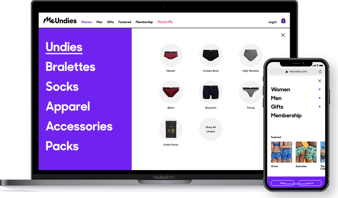
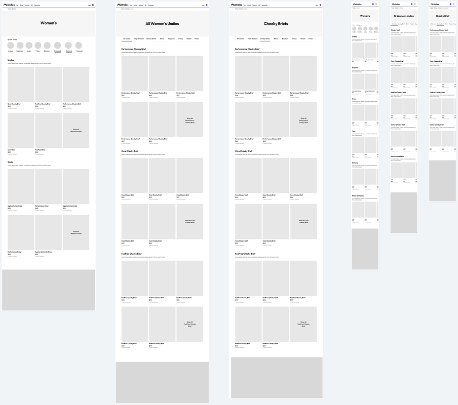
PLP before the redesign. The site merchandiser had virtually no flexibility over content and customers are not provided any filter options.
|
Inspiration Gathering
When looking at different PLP's for inspiration, I focused my research on brands that did the following particularly well:
Nike, Lululemon, Everlane, and Allbirds were all PLP's I paid close attention to. I printed them out and circled elements I liked and why I liked them. This inspiration, along with the core problems we were trying to solve, drove wireframe creation.
- Storytelling and content
- Navigating between different "fits" or "cuts"
- Filtering
Nike, Lululemon, Everlane, and Allbirds were all PLP's I paid close attention to. I printed them out and circled elements I liked and why I liked them. This inspiration, along with the core problems we were trying to solve, drove wireframe creation.
Phase I: Layout and Navigation Wireframing
Initial Concepting
|
Lauren, Leah, and I split off to come up with three wireframe concepts in 2 days for internal review. The goal was to generate as many solid ideas as we could and narrow them down to 2 or 3 for Phase I user testing. I came up with 6-8 different ways of accomplishing our goals for the PLP by using a technique called Crazy Eights. Since I was going to be regrouping with the UX team in 2 days to align on patterns we all wanted to move forward with, I wanted to come prepared with 3 wireframes that focused in on 3 of the core problems we were trying to solve.
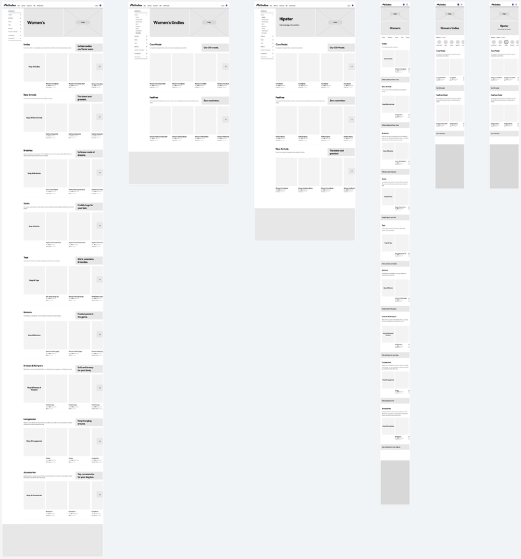
Concept 1: Let Me Tell You a Story One of my wireframes focused more on storytelling through the use of carousel content blocks. The goal of this design was to prioritize product breadth and fabric education at the L1 and L2 levels, so that users could be more confident about the product they want to purchase. I usually try to give my designs a catchy name to make them easier to refer to. This one was called "Let Me Tell You a Story." |
Desktop and mobile wireframes of a PLP concept I called "Let Me Tell You a Story." The idea was to focus on educating customers on our product breadth, fits, and fabrication via carousel content blocks. Customers wouldn't actually be able to select a product for purchase until the L3 level, but by then, he or she should have an above satisfactory understanding of MeUndies core offerings.
|
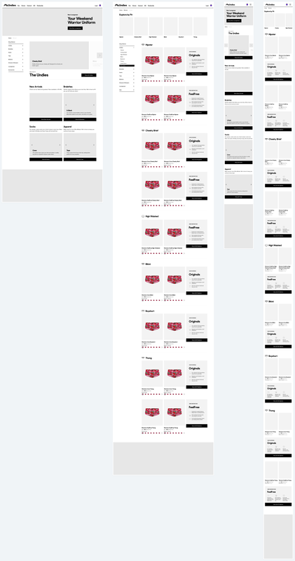
Concept 2: Operation Get to the PDP!
|
Another set of wireframes I created focused more on optimizing navigating to products and between categories of those products (i.e. navigating to undies and then between different types of undies). According to user research, users would typically find a category of product they wanted and want to easily explore and view their options within that category. It was very difficult to do that on the mobile version of our current PLP, as users would have to go into a drop down menu, select the category, and then the item within that category they wanted to view their options (and then do that over again if they wanted to view the other options). I opted for a tab structure to solve this problem, which allowed users to easily switch between styles. I also wanted to ensure users were able to see and learn about their fabric options once they found a product they liked. I created product "sections" for each fabrication, and made each section horizontally scrollable on mobile to save vertical space. For example, if a user was on a "Cheeky Briefs" PLP, they could easily explore our Core Modal, Cotton, FeelFree (no waistband), and Athletic fabrications straight from the PLP. Spoiler alert--these patterns ended up being used in the final design!
|
|
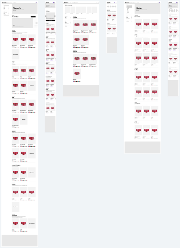
Regrouping & Creating Wireframes for Testing
After completing wireframes, Leah, Lauren, and I reconvened to review wireframes and discussed patterns we wanted to move forward with. After the meeting, Lauren and I printed out all of the wireframes, put them on a white board and labeled them. We talked through concepts we liked and disliked and the pros and cons of each. Ultimately, we came up with two options that consolidated the patterns we liked, and two variations of each option for a total of 4 concepts. After reviewing options with the development team, we were able to consolidate those 4 into 2 key options. The next step was to test these wireframes with real users!
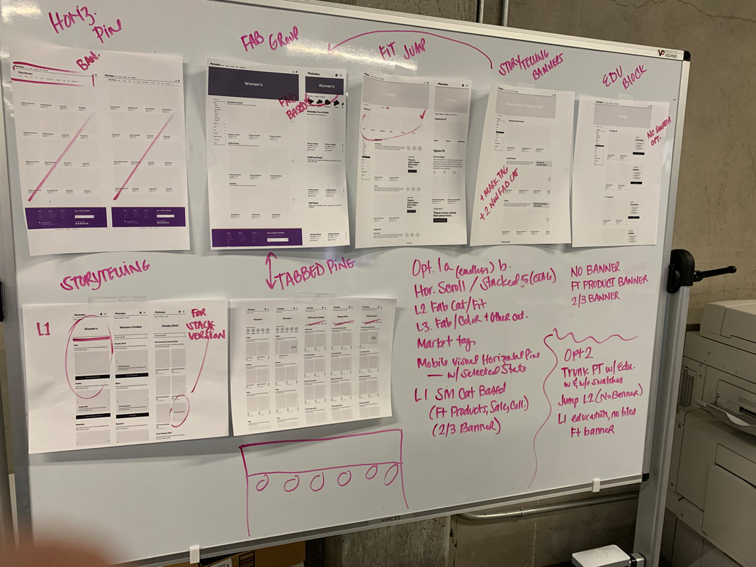
Process for identifying patterns of interest across wireframes. The objective of this exercise was to take patterns we liked from all of the wireframes and consolidate them into a couple testable options.
For option 1, I wanted to focus on improving the ease of navigation between categories and subcategories. The goal was to minimize frustration and enable users to find their desired product efficiently. This design also applied "marketing tags" to the core PLP pages; a pattern we all really liked as a design team. These were meant to imbue our brand voice throughout the experience and callout key aspects of the product the user should know about (i.e. "Zero Restriction" was a marketing tag used to call out that our FeelFree cut does not have a restrictive waistband). L2 and L3 pages were structured by fabrication (i.e. original MicroModal, FeelFree, etc.), and each section had a short description (along with a marketing tag) about what the fabric was. Finally, I wanted to know how users would react to horizontal scrolling, as it does help optimize our use of vertical space. Thus, all pages in the PLP experience (both desktop and mobile) make use of horizontal scrolling.
|
Option 2 was a lot more focused on storytelling and imbuing interactive content elements throughout the pages. We completely removed the ability to shop products on the L1, and instead provided users with a prominent carousel to learn about our different undie options, and less prominent carousels below to educate on our other product options. If a user wanted to shop all undies, they would be shown a screen sectioned out by cut (as opposed to fabrication in option 1) along with content blocks providing in-depth education on the fabrication.
|
Phase I User Testing
Research Goal
The goal of the first round of user testing was to uncover which, if any, CMS-driven education patterns and navigational elements best assist users in finding their desired product and learning about the breadth of product.
Research Questions
I typically like to write a series of research questions that I want answered as a result of the user test. My process was to group research questions by the core functions being tested: Navigation, Education, Hierarchy (i.e. the order of elements on the page), and Page Shoppability. Below were our core research questions by function:
- Navigation: How do users prefer to navigate between categories?
- Education: Can users understand what products we offer and the variations within them?
- Hierarchy: What are users looking for at the L1 level?
- Page Shoppability: How does horizontal scroll impact the user experience?
Outcome
The outcome of this research was a wireframe that consolidated elements of option 1 and option 2 into one design based on user feedback. Below are the answers to our research questions based on testing:
- Navigation: Users really liked being able to easily navigate between categories and cuts using the tab-like links on mobile in option 1.
- Education: Users found the content blocks in each section of the L2 to be helpful in Option 2. However, the redundancy of the fabrication content blocks was a bit confusing. It was clear that grouping by fabrication and providing a short description and marketing tag was the way to go.
- Hierarchy: On the L1, users liked the prominence we gave to undies, in Option 2, but liked how the other product options were laid out on Option 1, so we combined those concepts.
- Page Shoppability: Horizontal scroll worked for mobile, but was not as familiar a pattern on desktop.
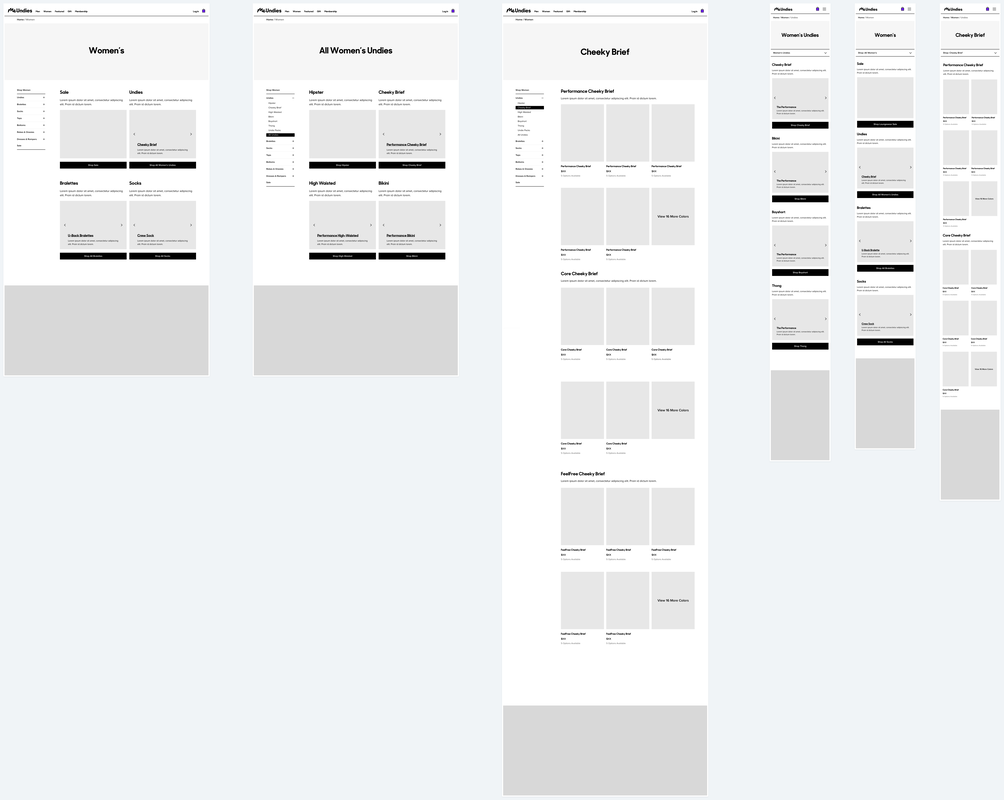
Consolidated Wireframe
Based on the findings from user testing, we created the wireframe below that consolidated the most effective features:
Phase II: Filter Wireframing
Overview
After aligning on a navigation and layout scheme for the PLP, the next step was start designing concepts for the "filtering" feature. We wanted users to be able to filter products by size, color, and, ideally, fabrication (which we eventually called "collection"). When a user applied filters, they would be presented with a list of products without the discrete groupings the user would see by default. Once again, to begin my design process, I gathered some inspiration and performed another Crazy Eights exercise to generate as many different concepts as I could.
Thought Process
When designing the filtering mechanism for the MeUndies PLP, I paid special attention to the following:
The MVP of filtering would only have a few filters, but we would expand into more in the future. I wanted to ensure the design solution could easily accommodate future filters. In addition, I wanted the design solution to respond elegantly across devices. Having multiple filtering options could be overwhelming and intrusive, especially on a mobile device. Thirdly, I wanted filters to be easy to access and use. Since users would likely be moving back and forth between filter selections and product browsing , I wanted the process of accessing and modifying filters to be seamless. Finally, I wanted filters to persist as the user navigated within a specific category (e.g., undies). If a user was to filter by size on a cheeky brief PLP, I'd want that filter to persist when looking at a bikini PLP (since a user likely would want to view the options available in the same size).
Lauren and I came up with two concepts to test with users: the "drawer" concept and "accordion" concept.
- Scalability
- Responsiveness
- Ease of access & modification
- Persistence
The MVP of filtering would only have a few filters, but we would expand into more in the future. I wanted to ensure the design solution could easily accommodate future filters. In addition, I wanted the design solution to respond elegantly across devices. Having multiple filtering options could be overwhelming and intrusive, especially on a mobile device. Thirdly, I wanted filters to be easy to access and use. Since users would likely be moving back and forth between filter selections and product browsing , I wanted the process of accessing and modifying filters to be seamless. Finally, I wanted filters to persist as the user navigated within a specific category (e.g., undies). If a user was to filter by size on a cheeky brief PLP, I'd want that filter to persist when looking at a bikini PLP (since a user likely would want to view the options available in the same size).
Lauren and I came up with two concepts to test with users: the "drawer" concept and "accordion" concept.
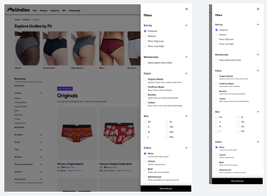
Filter Drawer Concept
|
In this concept, a "drawer" containing filter dropdowns expanded from the right of the page when a user clicked or tapped a "filter products" button on the PLP. Filters would be selected in the drawer, and then the user would click "show results" to view a filtered list of products. The drawer was favorable amongst stakeholders, and was my personal favorite. It was very scalable, since future filters could just be added as dropdowns in the drawer. It also responded very well across devices. All devices used the same exact drawer. One thing I was concerned about was easy of access & modification. In order to change filters, the user would have to open up the menu, change filters, and click show results every time. However, we also created filter "tags" that would be present on the PLP itself, so users could see and remove filters without opening the menu. They could even clear all of them by clicking "clear all filters." This feature minimized the severity of this issue.
|
|
Accordion Concept
|
The accordion concept was meant to be more easily accessible by having filter options exist right on the PLP (i.e. without opening a menu). Users would click a filter button, and filter options would appear right underneath the button, and above the products. One of the key issues with this design was that products in the product grid would be pushed down substantially on mobile and adding new filters would make this even more problematic.
|
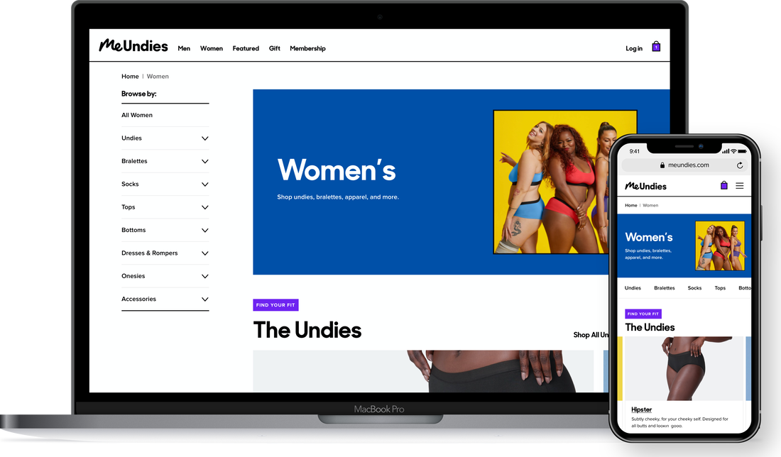
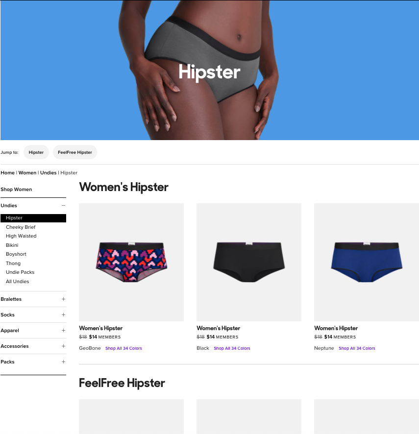
Final Design
The final PLP design provided an enhanced user experience, additional functionality, and greater opportunities for our marketing team and site merchandiser to tell stories.