|
Slimvance Checkout & eCommerce Flow
Role: UI/UX Designer Client / Organization: Slimvance (GNC Product) Designing a checkout experience and eCommerce flow for a GNC weight-loss product. |
Background & Goal
I was very fortunate to be able to work with GNC on the launch of their newest herbal weight-loss supplement: Slimvance. My team and I were hired to create an informational microsite for the product (www.slimvance.com), landing page experiences catering to different marketing campaigns, and a checkout experience. I still work with them on projects (some of which will be released soon), but my main project at the time of launch was creating the mobile and desktop checkout experience from scratch. The goal was to create a usable checkout process for the free trial of the product, which didn't come with free shipping. Users would receive a 30 day subscription of the product after the free trial, and would be charged accordingly. A lot of my research was competitive and based on best practices, as I didn't have access to user testing software for this client, and I was also a full time master's student at the time, so I was a bit strapped for resources. However, the final product was quite successful! Heat map data has shown plentiful interaction in the right places, and minimal friction. But of course, that is just the tip of the iceberg!
Requirements
One of the main requirements was to make checkout a quick, simple process, and the consensus was to make the desktop version 1 page. This decision was largely based on data we collected from one of our other clients, AARP. I actually assisted with the redesign of their cart experience, and we found that users converted more efficiently on a 1 page checkout. Another big requirement (at least initially) was that users needed to sign into, or create, a GNC account before claiming the free trial (that means no guest checkout). This really complicated the design process, as it is quite common knowledge in the UX world that making users sign in or create an account is a big deterrent.
Research / Competitive Analysis
The first step to designing the perfect checkout experience was to see what other successful, similar companies were doing. Since the checkout was specifically for a 14-day free trial, my goal was to find as many competitive experiences advertising something similar. The three main experiences I looked at were Peptiva, Instaflex, and Keranique. These checkout experiences were all for a free trial, and were known to be high converting:
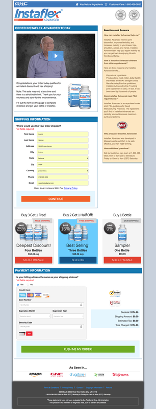
Instaflex Checkout Experience
|
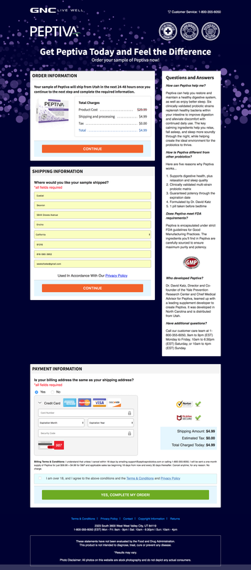
Peptiva Checkout Experience
|
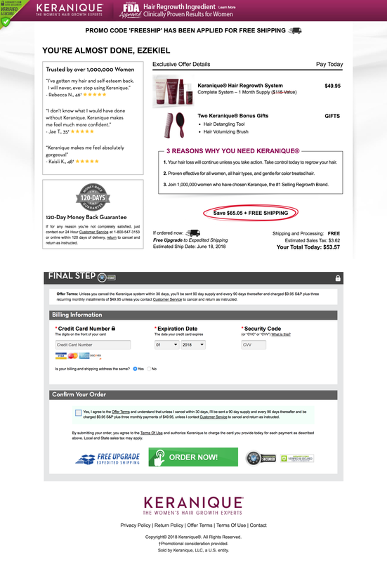
Keranique Checkout Experience
|
In addition to competitive research, I also thoroughly researched checkout best practices. In fact, we purchased an e-Commerce usability report from Braymard to make sure we were up to date on usability best practices.
Wireframes
Wireframing, for the most part, was fairly straightforward. I actually worked on these with a design contractor, Raquel. The most difficult part was integrating a method to log in / create a GNC account. Since there was no option for guest checkout, I didn't want to have users go through the process beforehand and risk aversion. My solution was to include it in the checkout form itself, but place it after the Shipping information. The idea was that users would have already entered a good amount of information, so entering an email and password to create or log into a GNC account wouldn't seem that bad. Users would receive feedback that they either logged into their account or created one successfully.
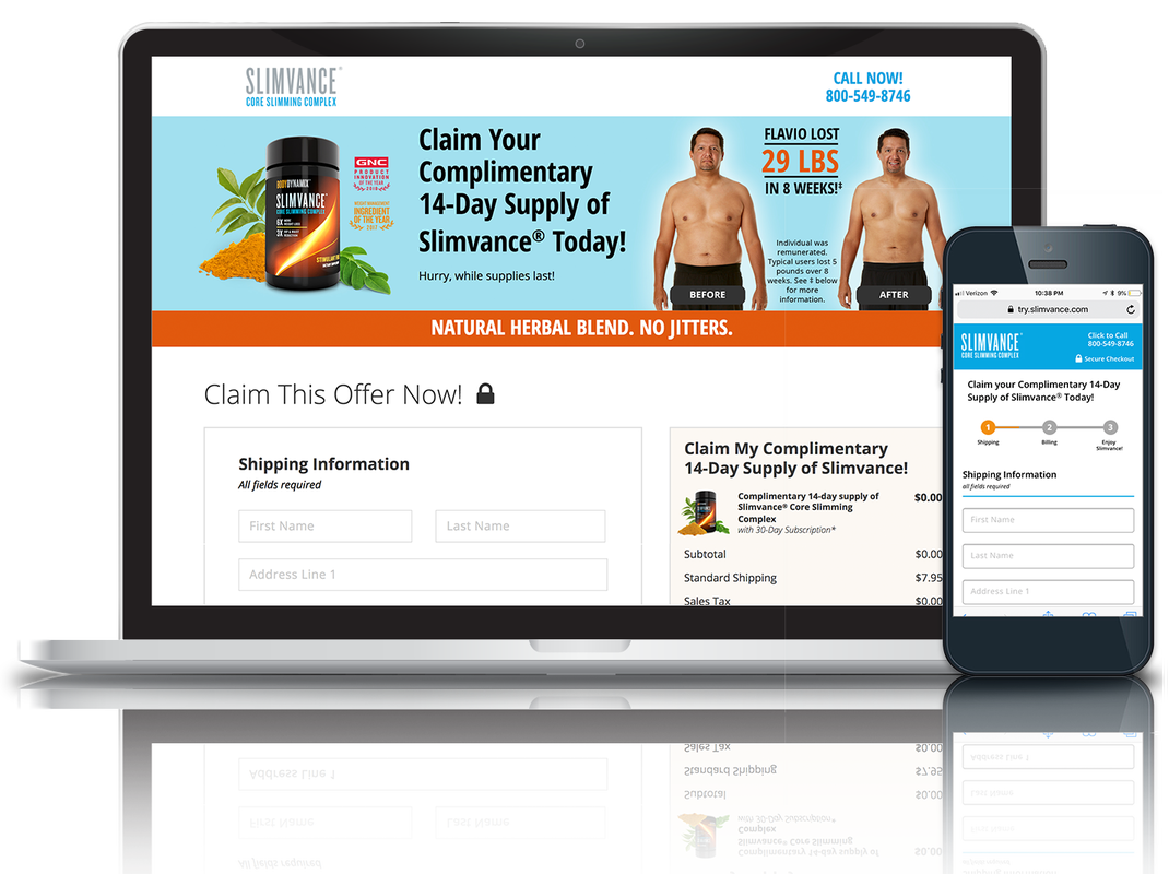
Since only one product was being sold, and it was just a free trial, there was no real "shopping cart." There was just the checkout experience. On pretty much every checkout experience on the web, users have continuous access to their cart sot they know what they bought and how much they should expect to pay. I adopted this concept, and designed the checkout to have a sticky "order summary." This order summary would be fixed to the right rail on desktop, and the top of the viewport on mobile. On mobile, the order summary would be completely expanded upon landing, and would collapse when the user scrolled down. The user would be able to expand and collapse the order summary at anytime.
Since only one product was being sold, and it was just a free trial, there was no real "shopping cart." There was just the checkout experience. On pretty much every checkout experience on the web, users have continuous access to their cart sot they know what they bought and how much they should expect to pay. I adopted this concept, and designed the checkout to have a sticky "order summary." This order summary would be fixed to the right rail on desktop, and the top of the viewport on mobile. On mobile, the order summary would be completely expanded upon landing, and would collapse when the user scrolled down. The user would be able to expand and collapse the order summary at anytime.
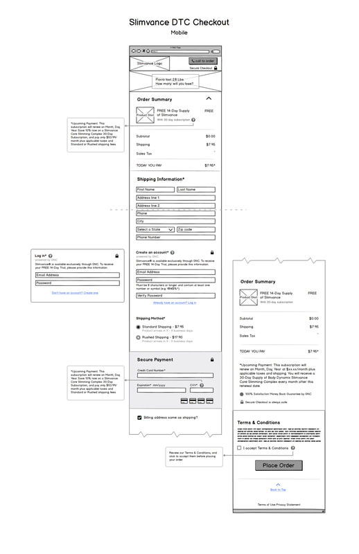
Mobile Checkout Wireframe
|
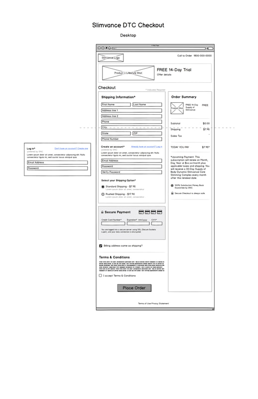
Desktop Checkout Wireframe
|
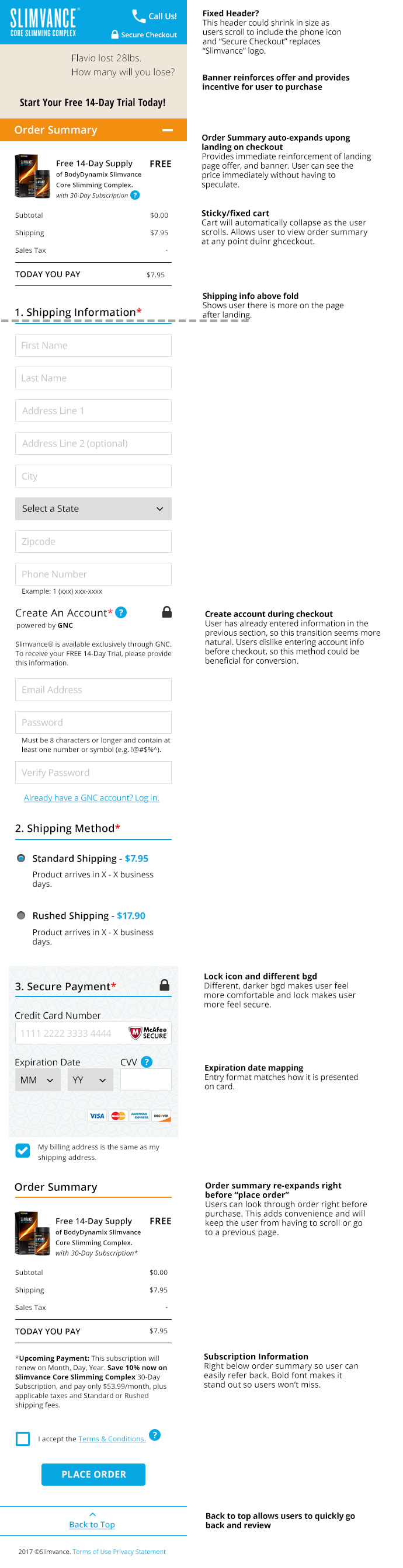
The CEO of our agency gave the thumbs up on these wireframes, so I moved to Photoshop to add a little visual design. Below is what the mockups looked like after this stage:
Mobile Checkout Mockup
|
Desktop Checkout Mockup
|
Feedback & Design Changes
After discussing the design more thoroughly with our lead developer, other members of my team, and even the CEO, we realized that this was a lot to scroll through on mobile. We didn't want users to land on the checkout and see the entire process all at once, as it could deter them from completing their purchase. It was decided to split the process on mobile into three steps: shipping, billing, and confirmation. The third step did not require any action; it was simply the thank you page confirming the user's order. Being that the mobile checkout was going to be multiple pages, there needed to be a way to easily edit information that was entered on a previous page. To account for this, I provided edit links on the second page. These would bring up an easy to use modal allowing users to change information. Below is what the live version of the mobile checkout looks like:
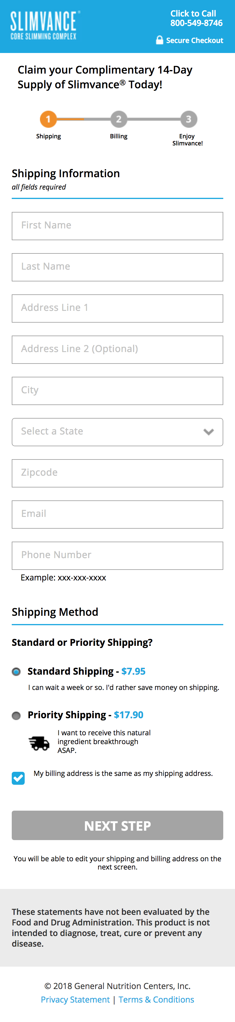
1st Step of Mobile Checkout
|
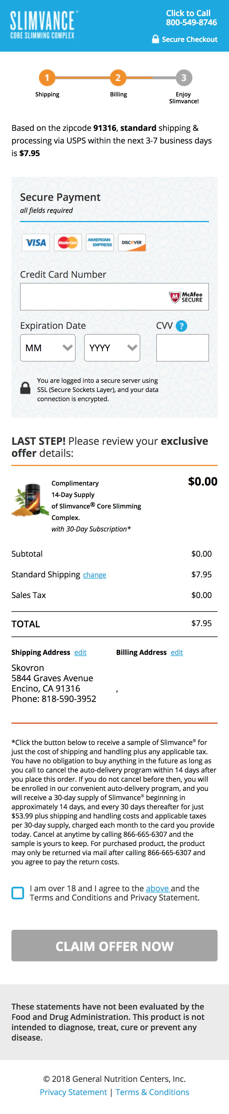
2nd Step of Mobile Checkout
|
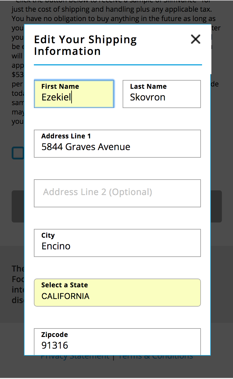
"Edit" Modal
|
I also created the "thank you" page that all users see once they have completed their purchase. Since I'd have to actually purchase Slimvance to show a live version of this page, below is a JPEG of the native file. This page was created with the assumption that other products, such as upsells, could be added to the user's order.
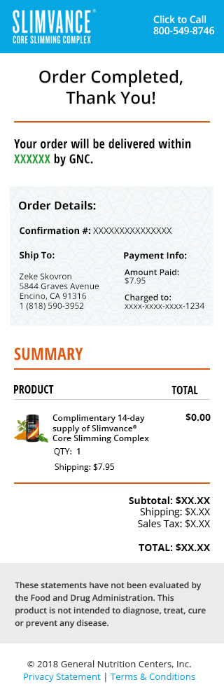
Mobile Thank You Page
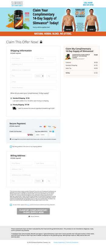
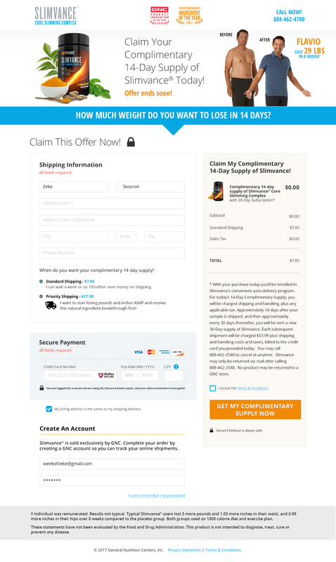
Below is the live desktop version of the checkout: