|
Typometric Prescription Usability Evaluation
Role: Usability Researcher Client / Organization: Knowability, Inc. Heuristic evaluation and moderated usability test conducted on a web application aimed at optimizing web experiences for low-vision users. |
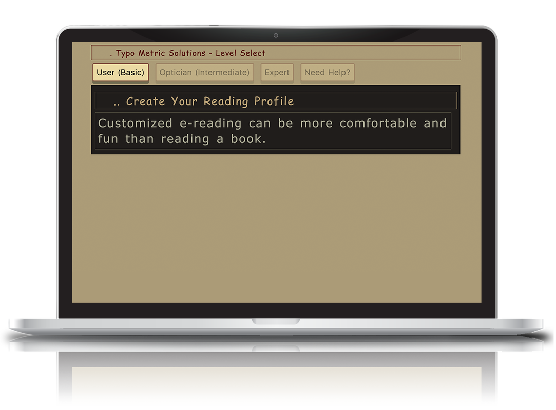
The InterfaceThe Typometric Prescription (TRx) is a web application that enables users to create a customized webpage configuration that can be applied to any webpage to improve its readability.
The application is intended to be used by low-vision individuals that typically experience difficulty reading pages on the web. The homepage (see Figure 1) allows the user to select what "type" of user you are (basic, intermediate, or expert). |
Figure 1 - TRx Homepage
|
Objectives
The purpose of this project was to uncover any critical usability issues with the TRx interface and provide potential design solution to remedy these issues
Below are the the test objectives set by myself and my team members. The italicized parentheses next to each objective represent the metric used to measure and accomplish that particular objective.
User Needs & Customer Requirements Analysis
Prior to conducting the evaluation, we conducted a user needs and customer requirements analysis
My team and I interviewed the creators of the web application to:
Below are the the test objectives set by myself and my team members. The italicized parentheses next to each objective represent the metric used to measure and accomplish that particular objective.
- Test the overall navigation of the website (lostness)
- Determine how efficiently the website allows users to accomplish tasks (time-on-task)
- Determine the website's effectiveness (task completion rate)
- Find out if users are satisfied with the website (system usability scale)
- Identify any areas of friction that could potentially impede accomplishment of user goals (open-coding / qualitative analysis)
User Needs & Customer Requirements Analysis
Prior to conducting the evaluation, we conducted a user needs and customer requirements analysis
My team and I interviewed the creators of the web application to:
- Clarify the purpose of TRx
- Clarify characteristics of the user population
- Discuss future directions of the project
- Define customer goals (very important!)
Heuristic AnalysisI went through the website on my own to identify any high level usability issues against Nielsen's 10 Usability Heuristics. Then, I compared my findings with the rest of my team to rate the issues by severity, with 0 being not severe at all, and 4 being very severe (something that should be fixed immediately).
|
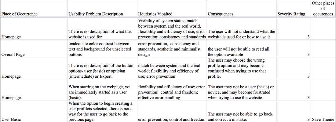
Figure 2 - Heuristic Analysis of the TRx Website
|
Usability Test
Nine tasks were created to challenge eight users':
Users performed tasks on a computer, while myself and my colleagues provided instructions via a microphone. Users were asked to think out loud while working through the tasks. One researcher moderated the test, while the other took notes. Demographic data was collected prior to starting the tasks, and a post-test and the System Usability Scale (SUS) were administered afterwards.
- Understanding of the website's purpose
- Ability to make text adjustments
- Color
- Line / word / letter spacing
- Text size
- Font type
- Ability to download a CSS file of their configuration
- Ability to navigate the websites
Users performed tasks on a computer, while myself and my colleagues provided instructions via a microphone. Users were asked to think out loud while working through the tasks. One researcher moderated the test, while the other took notes. Demographic data was collected prior to starting the tasks, and a post-test and the System Usability Scale (SUS) were administered afterwards.
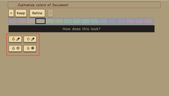
Figure 3 - Confusing Color Changing Buttons
|
What Was Found?
There were a lot of findings, but for the purposes of this description, I will only discuss one of the major findings from the usability test. Changing text and background color was difficult for users due to unclear button labeling. Users would click the buttons multiple times just to figure out what they did (see Figure 3)! There were no external labels and the help / question mark area was grayed out, leaving users helpless in this situation. |
|
Task 8 required users to change and select colors, and it too the longest to perform. Our metric suggested that the current mechanism for changing color is insufficient and should be changed.
|
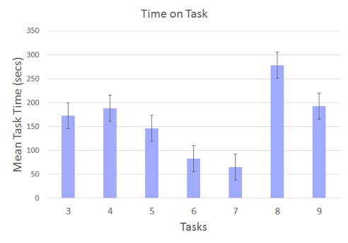
Figure 4 - Time-On-Task Data for Each Task
|
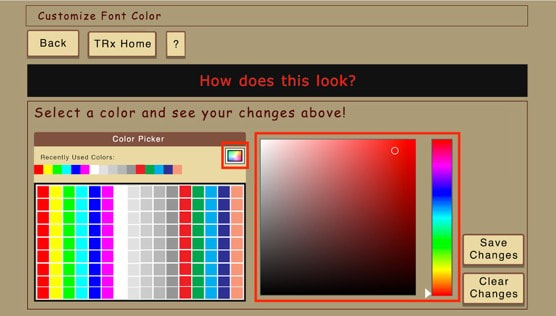
Figure 5 - Recommended Design for Color Changing
|
Recommendation
By triangulating qualitative user feedback and quantitative efficiency data, it was clear that color changing was a key area of friction. To remedy this issue I proposed a potential design solution enabling a color palette selection and "color gradient." This way, users can intuitively select a color and / or drag a cursor within the gradient selector and pick their specified brightness and contrast. |