|
Usability Evaluation & Redesign of the CSULB Website
Role: UI/UX Designer Client / Organization: CSU Long Beach Conducting a usability study on the CSULB website and re-designing it based on findings. |
Usability Evaluation
Methods
As a team of 8, we were tasked to conduct a usability evaluation of our school's website (www.csulb.edu). The site allows for two forms of navigation: a search function and in-site links that take the user to individual pages. The purpose of this test was to test the effectiveness, efficiency, and user satisfaction of these navigation methods separately to identify any significant differences between the two, and pain points users experience using each navigation method. A moderated in-person usability was conducted on 16 participants, with 8 told to perform two tasks using exclusively the search function, and the other 8 told to perform the same two tasks exclusively using the navigation links. Being that search is the most convenient method, and usually fairly accurate, we hypothesized that the search group would perform better than the navigation links group on all fronts (effectiveness, efficiency, and user satisfaction). The tasks users performed were:
Results
The results supported our hypotheses for efficiency and user satisfaction, but, surprisingly, navigation links performed better on our measure of effectiveness. Users in the "search" group took, on average, around 88 seconds to perform each task, while users in the "navigation links" group took approximately 178 seconds to perform each task (see Figure 1). This was expected because search is, by all means, a faster way to identify specific information. However, as it turns out, the search results weren't always the most accurate! Users in the "no-search" group were able to complete all tasks, while users in the "search group" had a task complete rate of 0.88. For task 2, the top search results actually did not even show the page containing the desired information! This led to users assuming the first one or two links contained the correct information, which actually turned out to be incorrect. Finally, "search" users rated the CSULB website to be more pleasurable than the "no-search" group. There were a variety of reasons users reported as to why the website was so dissatisfying to use. These will be discussed in the next paragraph, but as an example, there were a plethora of consistency issues (i.e. the website would look clean an modern at first, but certain pages were old and had a completely different navigation system), which made it unclear to users if they were even on the same site.
Methods
As a team of 8, we were tasked to conduct a usability evaluation of our school's website (www.csulb.edu). The site allows for two forms of navigation: a search function and in-site links that take the user to individual pages. The purpose of this test was to test the effectiveness, efficiency, and user satisfaction of these navigation methods separately to identify any significant differences between the two, and pain points users experience using each navigation method. A moderated in-person usability was conducted on 16 participants, with 8 told to perform two tasks using exclusively the search function, and the other 8 told to perform the same two tasks exclusively using the navigation links. Being that search is the most convenient method, and usually fairly accurate, we hypothesized that the search group would perform better than the navigation links group on all fronts (effectiveness, efficiency, and user satisfaction). The tasks users performed were:
- Imagine you are a biology student and are interested in a research opportunity with Dr. Gwen Goodmanlowe. You heard about her research from a fellow student, and you want to find where her office is so you can speak to her in person. Please find the location of Dr. Gwen Goodmanlowe's office (i.e. her office/room number).
- Imagine you have just switched majors from Math to History and want to determine how many units are required to complete the major. Please identify how many lower and upper division units are required to get a Bachelor of Arts (B.A.) in History.
Results
The results supported our hypotheses for efficiency and user satisfaction, but, surprisingly, navigation links performed better on our measure of effectiveness. Users in the "search" group took, on average, around 88 seconds to perform each task, while users in the "navigation links" group took approximately 178 seconds to perform each task (see Figure 1). This was expected because search is, by all means, a faster way to identify specific information. However, as it turns out, the search results weren't always the most accurate! Users in the "no-search" group were able to complete all tasks, while users in the "search group" had a task complete rate of 0.88. For task 2, the top search results actually did not even show the page containing the desired information! This led to users assuming the first one or two links contained the correct information, which actually turned out to be incorrect. Finally, "search" users rated the CSULB website to be more pleasurable than the "no-search" group. There were a variety of reasons users reported as to why the website was so dissatisfying to use. These will be discussed in the next paragraph, but as an example, there were a plethora of consistency issues (i.e. the website would look clean an modern at first, but certain pages were old and had a completely different navigation system), which made it unclear to users if they were even on the same site.
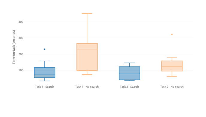
Figure 1 - Mean Efficiency (Time-On-Task) Per Task for Search and No-Search Groups
Three issues were derived from the qualitative analysis, which provided an explanation for the findings of our quantitative analysis:
- The level of specificity required for the search function to provide accurate results was to high. When searching for information regarding a "B.A. in History," the first result had to do with African American History, and not even the general history major!
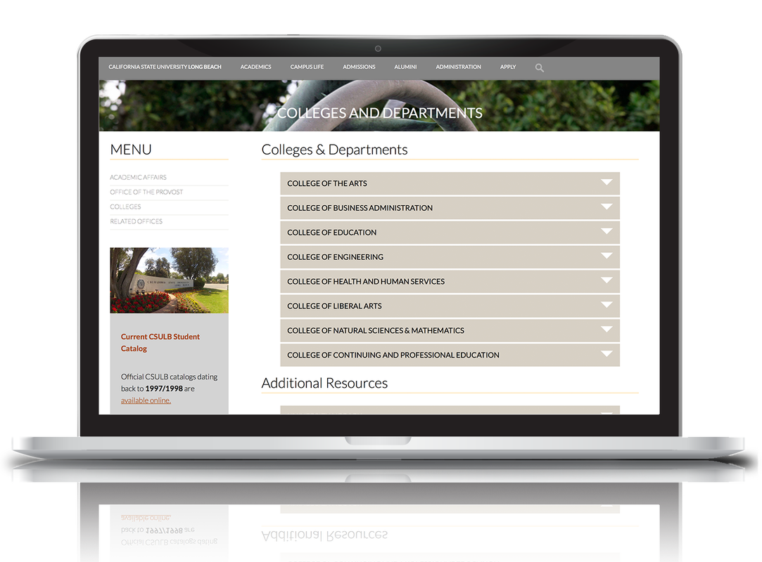
- The design and format of the CSULB website is fairly inconsistent across pages. As stated previously, users would start out on the modern, clean home page, but when going deeper into the site (i.e. to one of the department websites), the design would be completely different, and it would be unclear to users if they were on the same site (see Figures 2a and 2b).
- The navigation on the homepage was not centrally located, and presented way too many options up front. The navigation scheme on the homepage is a horizontal nav PLUS a hamburger menu that, when clicked, shows presents an overwhelming amount of information. In addition, the hamburger menu can occasionally be difficult to see.
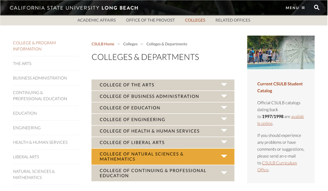
Figure 2a - A "modern, clean" page on the CSULB website. When clicking on the box highlighted in yellow, users are taken to the page in Figure 2b.
|
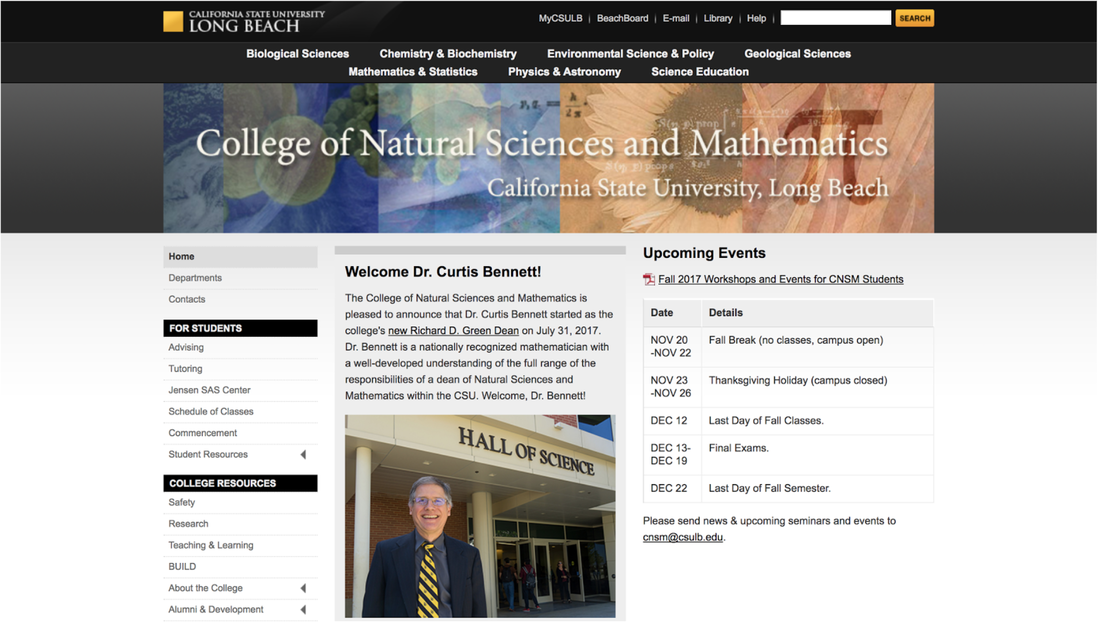
Figure 2b - The page users are taken to when clicking the yellow box in Figure 2a. Notice anything different about the format / layout?
|
Re-Design of the CSULB Website
The second project of this course was to focus on one usability issue identified in the usability evaluation, and use our knowledge of design principles to re-design the site in an attempt to remedy the issue. Our goal with the re-design was to increase efficiency of the CSULB website, without using search, by 15%. To do this, we aimed to resolve the three issues we obtained from our qualitative analysis in our re-design.
My primarily role for this part of the project was to create all of the mock-ups for the developers (the computer science and engineering majors on my team). Below is a sample of some of the mock-ups I created for the developers:
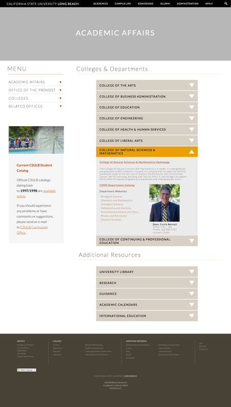
Figure 3a - Mock-Up of the Academic Affairs Page of the CSULB Website
|
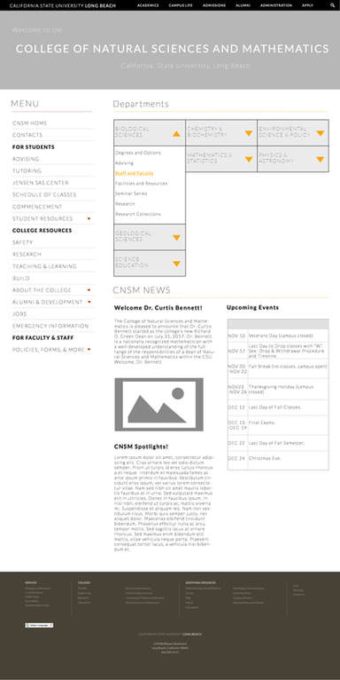
Figure 3b - Mock-Up of College of Natural Sciences and Mathematics Page (final product had some slight differences)
|
Please click the link below to download a .ZIP file containing the html files for our redesign! To view the site in your browser, simply extract the ZIP folder, open the extracted folder, and open the "home.html" file.
Download: Re-Design .ZIP